Ink Share
Tattoo App Concept
The tattoo industry can be intimidating for new tattooers and those indecisive about getting a tattoo, so I thought, why not make it easier?
The app’s goal is to bridge the gap between the user and the artist to find the right match. The design should be effortless and easy, so you can navigate through the app without thinking whether you’re tech-savvy or not. It’s not just about finding a tattoo artist you love, but the style that is the best fit for your vision.

The Competition
Before diving into UX design with card sorting, I researched the competition to evaluate how I could create minimal design while creating a pleasing user experience for the consumer and tattoo artist.
TattooDo
The app is like Facebook, but for tattoo artists and enthusiasts. However, with that approach, the style search is limited, and you can’t directly book with the artist; you have to go through the shop. The user experience felt forced, so I wanted to add a UI element that allowed the customer to book with the artist instead of through the tattoo shop (Noted 2016).
Tatshare
After creating the wireframe, I discovered Tatshare, an app with a similar concept to Ink Share. The customer can easily see the artists’ information on their profiles, but, with Tatshare, the customer can’t book directly through that app, pushing the user to contact the artist’s email. The UI design is complicated, and the UI seemed dark and cluttered (Noted 2016).

Card Sorting
After thorough research on the competition, it was time to dive into a UX method called Card Sorting. This approach, using post-it notes or flashcards, allowed me to visually see how the navigation works before going digital, which helped me see the gaps in navigational flow. Using card sorting helped prepare me for the next step in the process, the sitemap.

The Sitemap
Creating the sitemap became the visual reference to helping sort out the UI flow and how it would function. The sitemap detailed every app’s function, from the artist feed (location-based and who you’re following) to the inbox, booking, user profiles, and user setting preferences.
Airbnb and Instagram’s minimal UI design inspired me to further push the design by creating a user-friendly, easy-to-use prototype. Their level of attention to detail helped dedicate Ink Share’s overall UI to how I wanted the app to look and work.
The Wireframe
Before applying visual design, I created the wireframe, a skeleton of how the app would function. There are different forms of wireframing, from pen & paper wireframes to digital (which I’ve provided). The wireframe depicts the user feed option (followers and discover), search settings, style preference checkbox, and user profile, which allows the user to organize boards by tattoo styling. Pinterest inspired me because I liked how their users could create mood boards based on preferences.
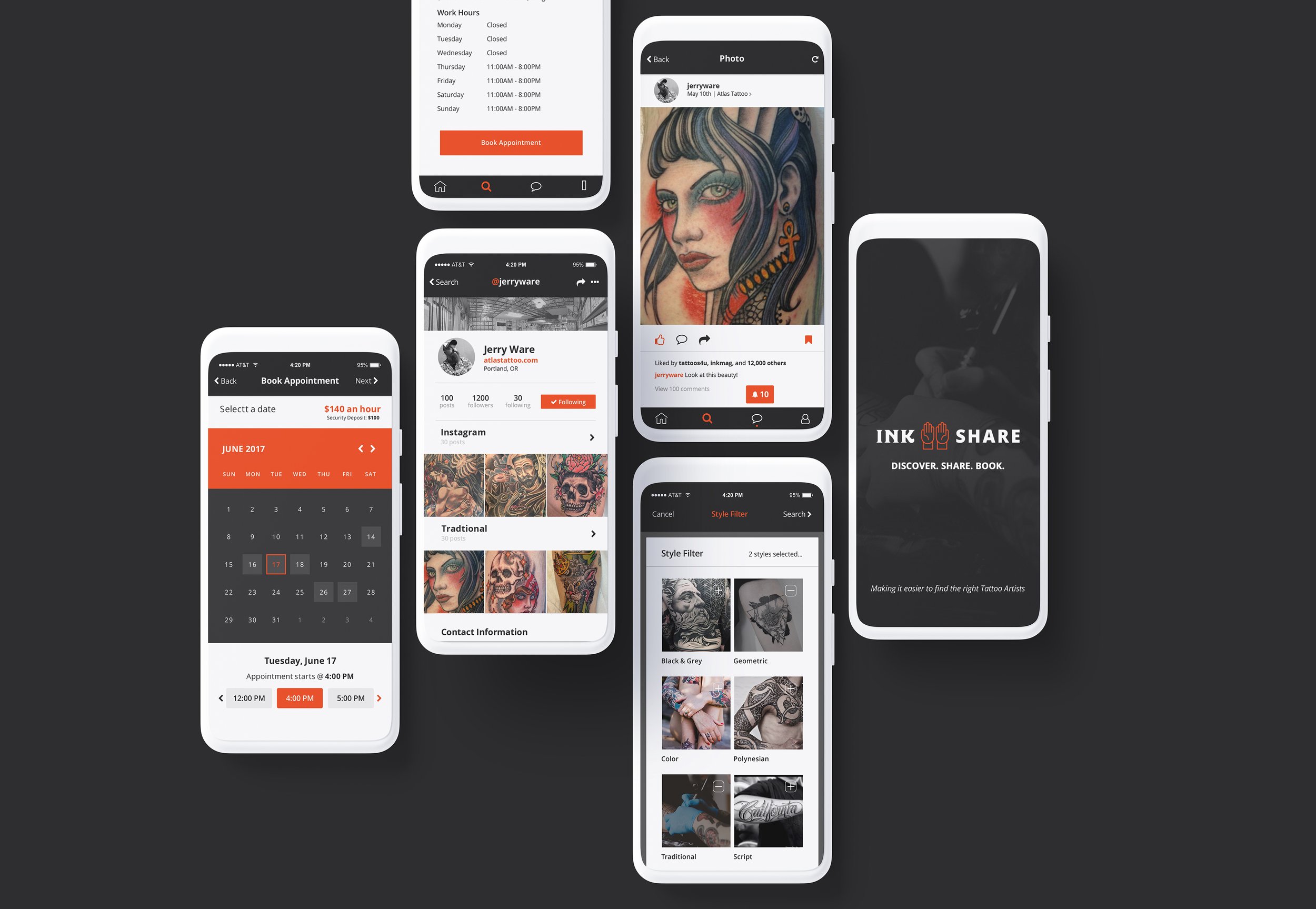
Hi-Fidelity Prototype
After solidifying the brand identity, I began the app design; the Hi-Fidelity Prototype ended up being over 50 screens, and I spent over 40 hours constructing the app. To create an interactive feel, I uploaded the UI to InVision, a prototyping app that brought the design to life.
Four years ago, I looked into funding and angel investors, but unfortunately, this project never kicked off. Regardless, even if this app never gets funding, it was a great experience to conceptualize an app that could have revolutionized the industry.
Brand Identity
Logo | The name “Ink Share,” originated from two sources: Ink-referencing the ink tattoo artists use and Share-references sharing/trading services. The open hand gesture was inspired by Buddhist Mudra Statues, which means to “give.” The design intended to create something that tattoo artists would love, and friendly for new tattoo users; Ink Share was the perfect solution.
Color palette | Orange/red, light gray, white, and charcoal.
Typography | Ink Share uses two font styles: Lato, a modern San Serif typeface ranging from thin to thick line weight. Regina Black is a display font I found from LostType; it’s a thicker font with only two style choices, Solid to Hilte. I liked Regina because it reminded me of a modern take on traditional tattoo lettering. The two typefaces together exude a marriage between the traditional and the new of tattoo perspectives.
