Mariya Stangl
Art Direction | Branding
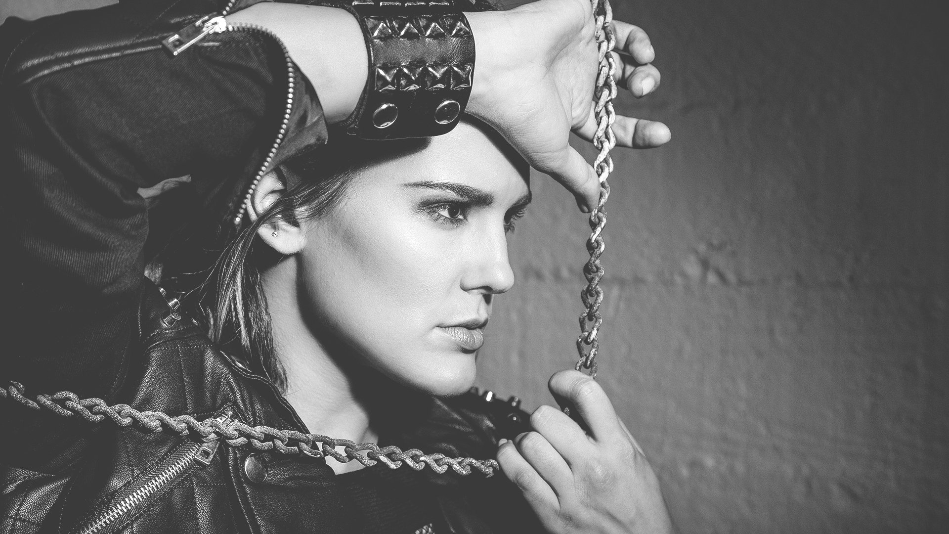
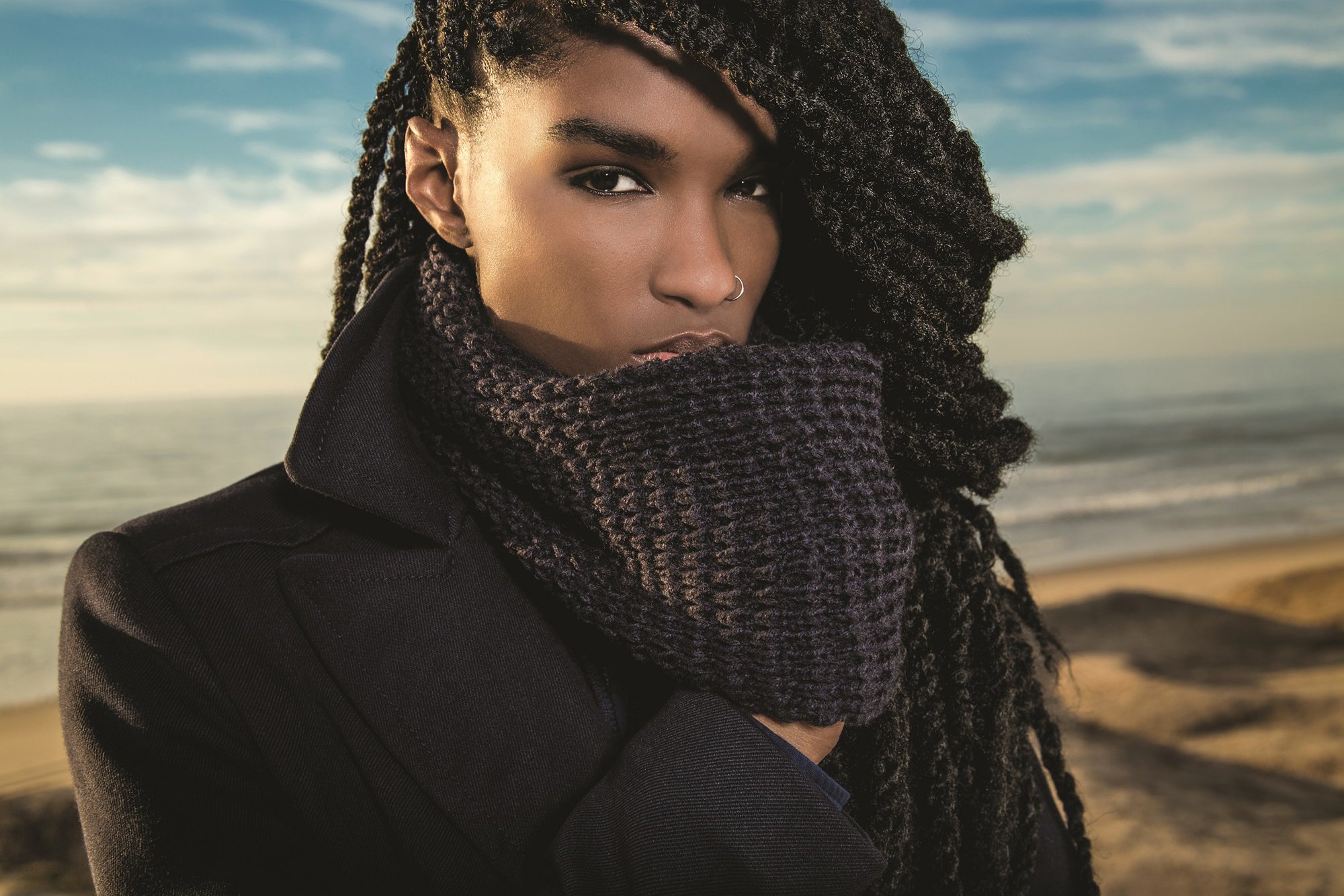
I first met Mariya when we both were living in Portland, Oregon. In June 2016, I decided on a whim to move to the Bay Area; we reconnected when I moved to Oakland. She is a talented contemporary fashion photographer, and her photographs embody strong and empowered female figures.
Being attracted to her style of photography, I was delighted to help her with her logo mark and to oversee the design of her thesis magazine, “Freedom to Choose.” Her thesis aimed to empower her models, thereby enabling her audience to adopt the opposite sex’s traditional gender roles of the opposite sex.

Project Brief
Mariya and I had a similar design taste, clean and modern with a twist. Narrowing down the design process for both the magazine and the logo, we created a mood board on Pinterest to share our design inspiration.
Logo Design
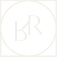
Mariya is originally from Montana, so we were drawn to the shape of a triangle to represent her hometown’s mountains. However, as the logo transformed, and as a proclaimed feminist, she identified the upside-down triangle as the “feminine” symbol. Using the letter M in the triangle created negative space in the triangle, forming a mountain shape. The mountain and the triangle gave the nod to her past and present.
Magazine Design
Using the Pinterest mood boards as inspiration, we quickly picked a look and feel for her fashion thesis magazine. Mariya’s color palette was vibrant, with bold colors, each spread using different typography treatments depending on the theme. The full 80-page magazine is now for sale on Blurb. To view the entire magazine, click on the link below.


Brand Identity
Logo | Using the letter M in the triangle created negative space in the triangle, forming a mountain shape. The mountain and the triangle gave the nod to her past and present. The upside-down triangle symbolized the meaning “feminine.”
Color palette | Orange, gray, white and charcoal.
Typography | Tofino is Mariya’s signature font. Tofino, like Mariya’s photography style, has a broad range of line weights from Ultra Bold to Thin. We used this typeface throughout the magazine. Although the typeface is varied, the styling seems cohesive and brand-centric.