
PayPal
ART DIRECTION | WEB DESIGN | UI & UX
In 2018, PayPal acquired Zettle, a point-of-sale platform with strong international adoption but limited traction in the U.S. At the same time, PayPal was competing with platforms like Square, Clover, and Toast, which offered clearer product ecosystems for merchants.
The Zettle and Omnichannel experiences were fragmented across multiple PayPal properties, making it difficult for merchants to understand how the products worked together.
INTERNAL ANALYTICSRevealed that 88% of merchant traffic landed on a few product pages, often skipping the homepage. This limited view hindered their understanding of PayPal’s POS ecosystem, leading to confusion and sign-up drop-offs.
The Challenge
The goal was to unify the Zettle experience within the PayPal ecosystem and enhance the product narrative for merchants seeking POS solutions. The team focused on consolidating Zettle into cohesive product pages that align with PayPal’s global design system, prioritizing the UK pages first to facilitate international scalability. This approach required close collaboration across global teams.
OLD DESIGN
The Zettle by PayPal pages were previously fragmented across multiple PayPal properties, causing confusion for merchants about how Zettle and Omnichannel products work together. Key information, such as merchant proof points and product benefits, was often buried, hindering user experience. The redesign decisively addresses these issues by simplifying the experience, unifying the product ecosystem, and prominently showcasing essential information to enhance clarity and engagement.
WIREFRAMES & CONTENT
We analyzed the Zettle by PayPal experience against U.S. POS pages using Attention Insight heatmaps to assess layout performance. This evaluation highlighted strong visual clarity in Zettle, but noted that key elements like product value and merchant proof points were often positioned too far down the page. Additionally, reviewing competitors such as Square, Toast, and SpotOn revealed opportunities to enhance hierarchy, accessibility, and conversion paths.
Key Constraints
Although I was initially brought on to lead the Zettle migration, the timeline shifted significantly as PayPal accelerated its merchant unification efforts. Due to the compressed schedule, I collaborated closely with Chris Sander’s team to support both the Zettle migration and broader merchant unification work.
The project ultimately moved from a longer design cycle to a focused two-month sprint to launch. This required the team to work within PayPal’s existing design system components rather than introducing new patterns.
At the same time, the experience needed to scale globally, ensuring consistency across markets while aligning with PayPal’s brand standards.
Design Execution
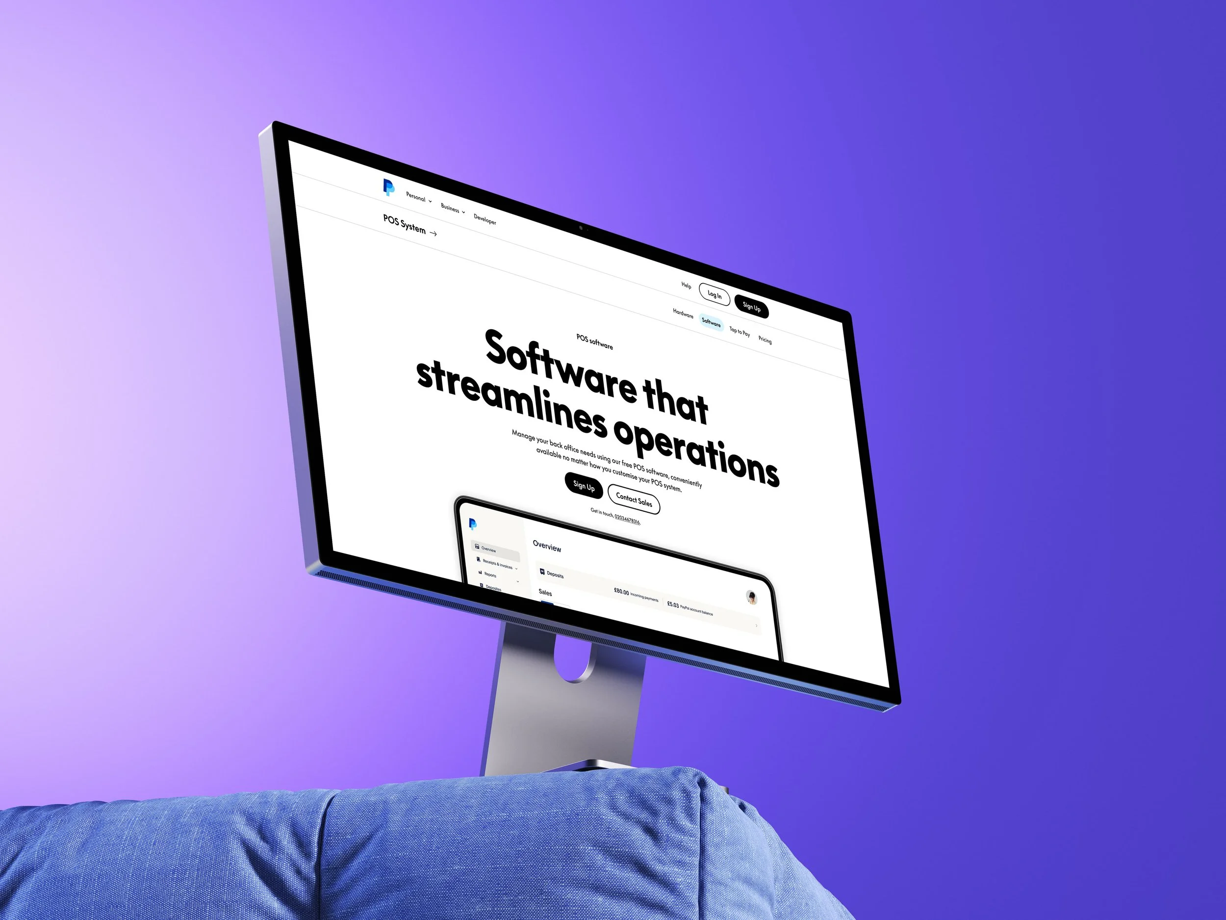
With the page structure established, the next step was translating the wireframes into production-ready visual designs aligned with PayPal’s global design system.
I recreated product UI assets not available in Figma and adapted existing design system components into layouts that could be implemented quickly by engineering.
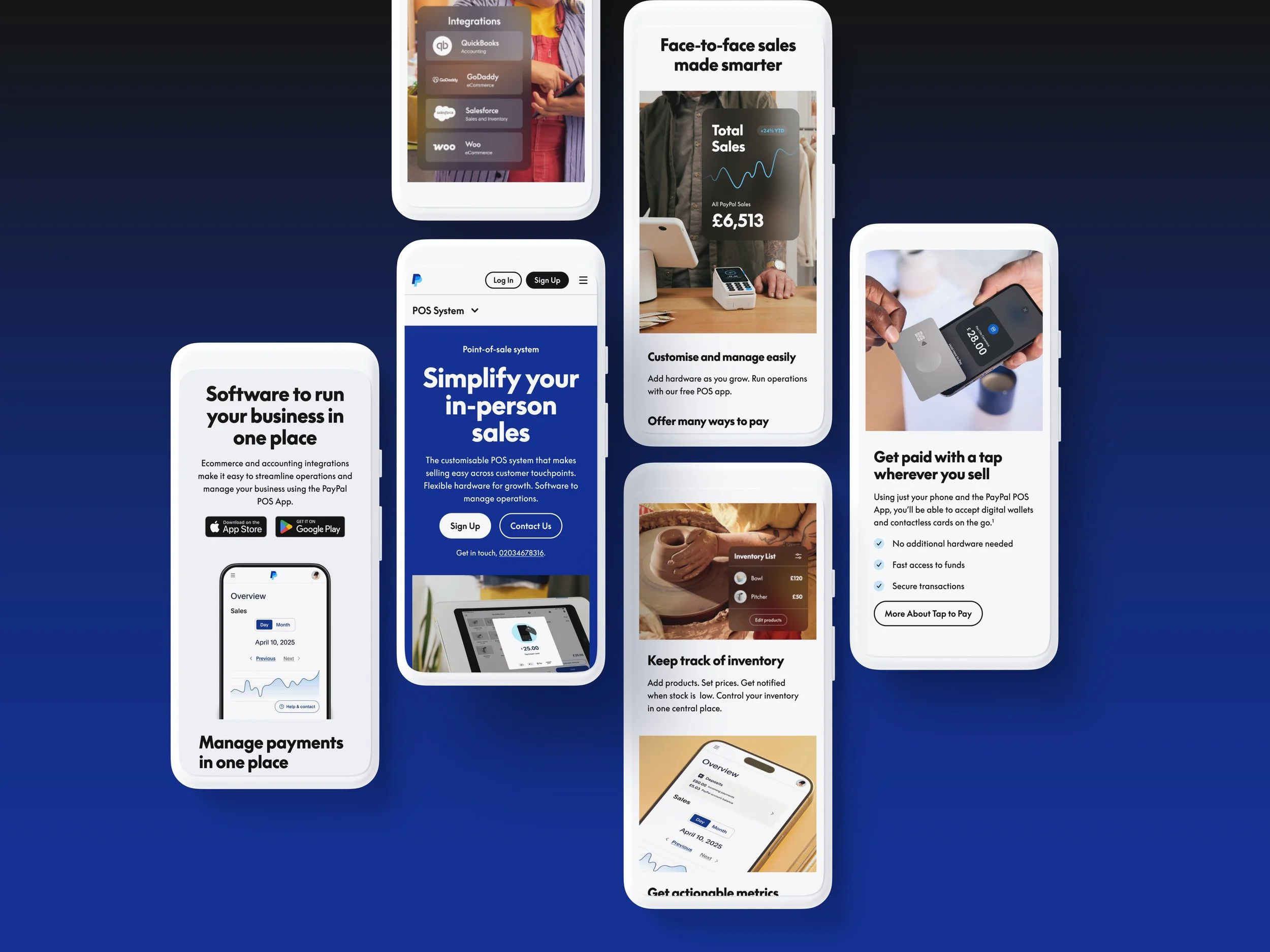
The final designs improved clarity and hierarchy across the POS experience while remaining consistent with PayPal’s existing system.
System & Implementation
The final layouts were designed to support PayPal's global marketing infrastructure and to scale effectively across international markets. This process required close collaboration among product, design, and engineering teams to ensure that the framework could accommodate localization while maintaining consistency with PayPal's design standards.
The deliverables included user research documentation, content frameworks for global point-of-sale (POS) pages, wireframes and visual design concepts, recreated product UI assets, and authoring documentation for the engineering handoff.
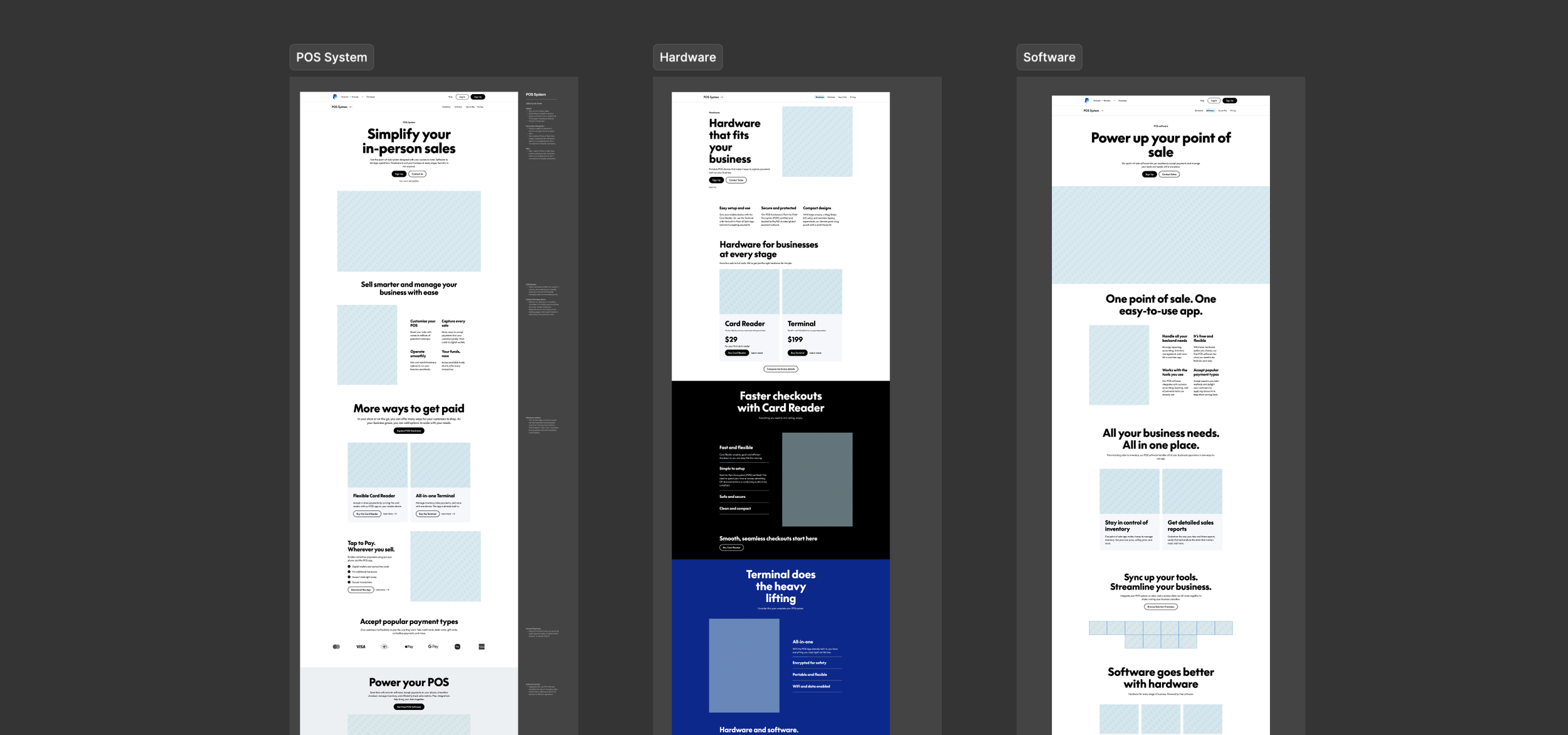
Launched Pages
The redesigned POS pages were launched first in the UK and U.S., establishing the foundation for PayPal’s international market.
Conclusion
The redesigned POS pages have made navigation simpler and clarified how PayPal's POS ecosystem functions together, helping merchants better understand the available tools. The project transitioned into a two-month sprint, which required the team to work quickly within PayPal's existing design system. Despite the tight timeline, we successfully delivered a cohesive framework that supported PayPal's global rollout and enhanced engagement across key merchant flows.
PROJECT CREDITS
Chris Sanders (Design Director), Cesar Lopez (Visual Designer II), Cecelia Tramaine Nelson (Global Design Director), Content team, Sandy Wright (Strategist), and many more who are not mentioned.
Exclusive Page Design
The Zettle Handshake page examined ways to connect the Zettle brand with the overall PayPal experience. Although the page was not launched because of Zettle's strong brand recognition in Europe, it was created as a potential lead-generation concept.